
- The Fenced Forest -
← Back to home

The Signal-Centric Design System: Built for Cognitive Load and Architected to Scale
7 mins read

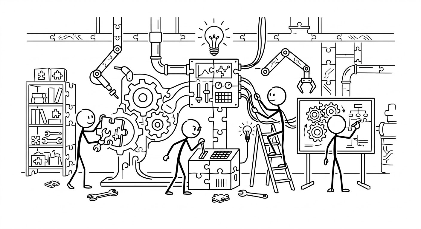
When I joined, we didn't have an enterprise-grade Design System. What we had was a well-established consumer-facing system designed for ease of use and simplicity, not data-dense operational needs. The challenge wasn't just design. It was getting the organisation to align behind a dedicated Design System, securing engineering resources through project office, and then architecting a framework so it could scale across 32 platforms while respecting the brand, the existing systems, and how it should sit within this ecosystem.
All while overseeing project deliveries in parallel. In hindsight that constraint probably made it more pragmatic than it would have been otherwise.

Designing for enterprise
Enterprise tools ask something fundamentally different of their users than consumer products do. Users working across hundreds of clients, pipeline stages, maturity dates, and compliance deadlines in a single session aren't browsing. They're operating under sustained cognitive load, making high-stakes decisions with incomplete information, often under time pressure. The design question isn't how to make the interface feel considered. It's how to make it legible under pressure.
More importantly, any team members with consumer-grade design instincts had to be unlearned.
Studying and reconciling two source design systems within a shared brand
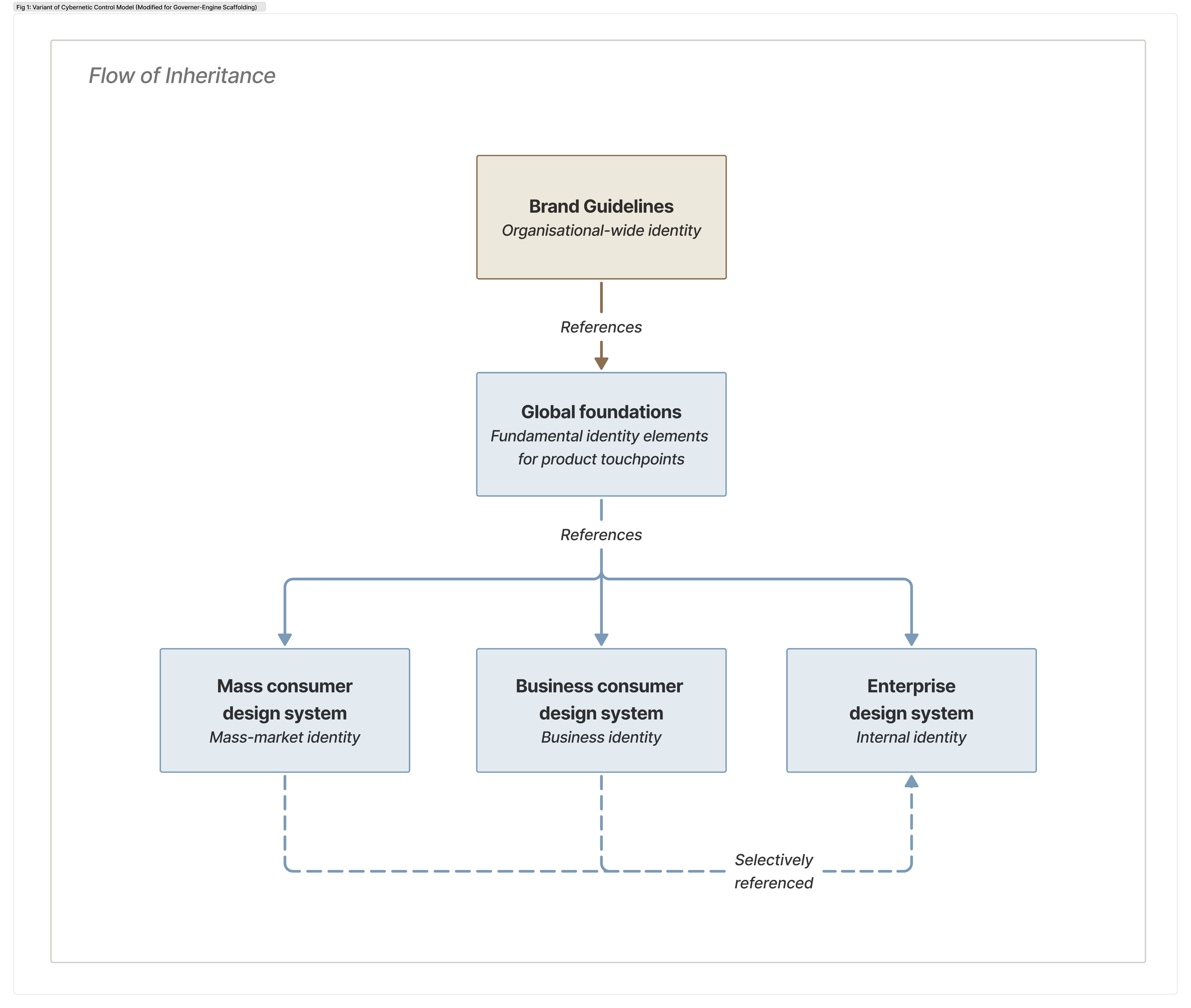
I had two existing systems to work with. One was a mass consumer-facing system built for marketing and product surfaces, the other a corporate system serving business customers. Sitting above both was an overarching brand guideline covering visual logic, typography, colour, and spatial principles.
This new DLS had to be neutral to every business unit and their use cases, so the challenge wasn't decomposing just one source. I needed to understand the logic and constraints of all three. Where they aligned, where they diverged, and where none of them had answers for the environment we were building for.
I treated the brand guidelines as the connective tissue. They set the boundaries within which both existing systems operated, and within which ours had to as well. The goal was a DLS that teams touching consumer or corporate banking contexts could recognise as part of the same family, without contradiction or friction.
From there, I consumed styles from both DLSes selectively. What could be shared and had transferable design to a data-dense operational environment survived. What was decorative or surface-specific was set aside. The expression was adapted where applicable and rebuilt from the atomic level up. This new DLS had to be empowering, data-dense, and task-oriented.
Building at the atomic level
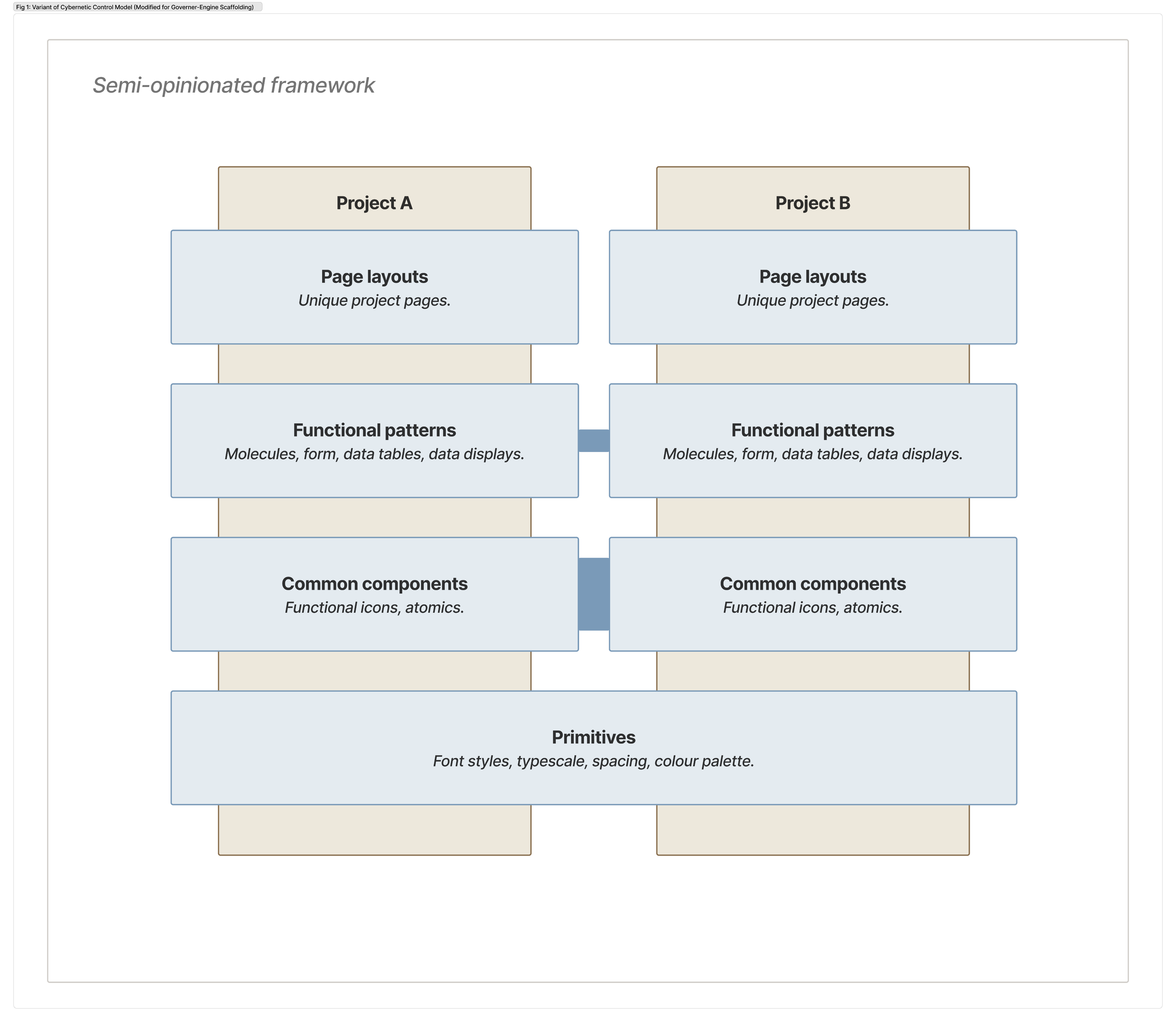
The DLS was architected in four layers.
- Primitives as the non-negotiable foundation, colour tokens, spacing, typescale, interactive states.
- Common components as the shared baseline across every platform.
- Functional patterns and large component groups as composable layouts for platform-level adaptation.
- Page layouts and large patterns as highly composable, context-specific, owned by individual platform teams.
Every token and interactive state was defined at the primitive level as a constraint rather than a guideline. This gave the engineering team a stable foundation to build from and gave every subsequent platform team a clear line between what was fixed and what was theirs to adapt.
The primitive layer was anchored to the shared brand, ensuring whatever adaptations happened above it, the DLS remained recognisably part of the same family.
Colour as a regulated signal system
The signal-centric principle showed up most visibly in the colour approach and had ran through WCAG standards to ensure accessibility standards are met.
Slate is our monotone base. It is tuned to play a crucial role in establishing hierarchies, groupings, and spacing. Colours had 2 sets, a strict secondary group tied to colour signalling logic:
- Traffic-light start-stop logic coding used for workflow statuses.
- Call-out severity by urgency levels.
- Clear differentiators by action types, e.g. Primaries and Secondaries.
And a larger collection tertiary colour group with low-opinionated usage guidelines, which project teams could freely use:
- Signifiers for content types.
- Data visualisations.
In a screen with 36 upcoming client items, a single amber tag for an overdue credit review has to be immediately noticeable without the user hunting for it. That only works if nothing else is competing for the same attention. Colour used everywhere stops being a signal ↗. It becomes part of the noise.
Restricting it to one role, enforced at the token level through Storybook so teams consumed the palette rather than defined it, was what made the system legible at density. Deviation was still possible. It just had to be deliberate.
Winning the early adopters and building momentum
Ease of use and a lightweight solution doesn't guarantee adoption. That required a different kind of work, so I went with a two-pronged approach.
- I secured top-down buy-in and had a squad assigned for DLS and Storybook. This created mandates for organisational pressure that can be tightly coupled with mass platform migration needs. I rode that momentum and made the DLS the natural landing point for other teams that had to move anyway.
- Bottom-up, I engaged the first wave of engineers early, getting them familiar enough to advocate within their subsequent projects. Their teams adopted faster, held the constraints more consistently, and became the reference point ↗ others looked to automatically. They in turn, looked to me as Design Gate whether to codify non-standard interactions. (This would become a federated model, something which I will write about next time).
The coupling of both was where it clicked. Project teams maintaining their own offshoot DLSes found it increasingly difficult to justify doing so. Entire engineering clusters naturally migrated to a system they could finally call their own. This particular cluster that I worked with maintained 32 systems and they now have a unified DLS.
The goal wasn't compliance. It was internalisation that has helped to benefit both departments. By the end of the day, we had a big cross-collaborational story to celebrate.
Scaling to multiple clusters and countries
When it came to cross cluster and multi-country adoption, the approach was different. I was aware that each cluster had their own platforms with own patterns, pressures, and existing ways of working. It made orchestration conversations a bit more difficult. A constraint that landed easily in 1 cluster required 3 more conversations in another, and that is easily multiplied across countries.
For that I positioned the DLS solution to them in the form of a ‘toolkit’ ready for adoption when they had the appetite or capacity. Confidence came naturally as the DLS had already been adopted by one cluster. Sometimes even other project teams could defend it without me in the room.
While still in its early days across other clusters, the conversations had already shifted from 'here is the DLS' to 'here is why it exists.' Eventually I didn't need to be in those conversations at all. In fact another country has since connected and has started adopting it.
The composable model did the heavy lifting. Derivative styling was permitted, provided teams respected the baseline. Escalations became rare.
That's probably the outcome I'm most quietly satisfied with.
Not that the DLS was built, but that it held without needing to be held.


© 2025–2026 Kevyn Leong

- The Fenced Forest -
← Back to home

The Signal-Centric Design System: Built for Cognitive Load and Architected to Scale
7 mins read

When I joined, we didn't have an enterprise-grade Design System. What we had was a well-established consumer-facing system designed for ease of use and simplicity, not data-dense operational needs. The challenge wasn't just design. It was getting the organisation to align behind a dedicated Design System, securing engineering resources through project office, and then architecting a framework so it could scale across 32 platforms while respecting the brand, the existing systems, and how it should sit within this ecosystem.
All while overseeing project deliveries in parallel. In hindsight that constraint probably made it more pragmatic than it would have been otherwise.
Designing for enterprise
Enterprise tools ask something fundamentally different of their users than consumer products do. Users working across hundreds of clients, pipeline stages, maturity dates, and compliance deadlines in a single session aren't browsing. They're operating under sustained cognitive load, making high-stakes decisions with incomplete information, often under time pressure. The design question isn't how to make the interface feel considered. It's how to make it legible under pressure.
More importantly, any team members with consumer-grade design instincts had to be unlearned.
Studying and reconciling two source design systems within a shared brand
I had two existing systems to work with. One was a mass consumer-facing system built for marketing and product surfaces, the other a corporate system serving business customers. Sitting above both was an overarching brand guideline covering visual logic, typography, colour, and spatial principles.
This new DLS had to be neutral to every business unit and their use cases, so the challenge wasn't decomposing just one source. I needed to understand the logic and constraints of all three. Where they aligned, where they diverged, and where none of them had answers for the environment we were building for.
I treated the brand guidelines as the connective tissue. They set the boundaries within which both existing systems operated, and within which ours had to as well. The goal was a DLS that teams touching consumer or corporate banking contexts could recognise as part of the same family, without contradiction or friction.
From there, I consumed styles from both DLSes selectively. What could be shared and had transferable design to a data-dense operational environment survived. What was decorative or surface-specific was set aside. The expression was adapted where applicable and rebuilt from the atomic level up. This new DLS had to be empowering, data-dense, and task-oriented.
Building at the atomic level
The DLS was architected in four layers.
- Primitives as the non-negotiable foundation, colour tokens, spacing, typescale, interactive states.
- Common components as the shared baseline across every platform.
- Functional patterns and large component groups as composable layouts for platform-level adaptation.
- Page layouts and large patterns as highly composable, context-specific, owned by individual platform teams.
Every token and interactive state was defined at the primitive level as a constraint rather than a guideline. This gave the engineering team a stable foundation to build from and gave every subsequent platform team a clear line between what was fixed and what was theirs to adapt.
The primitive layer was anchored to the shared brand, ensuring whatever adaptations happened above it, the DLS remained recognisably part of the same family.
Colour as a regulated signal system
The signal-centric principle showed up most visibly in the colour approach and had ran through WCAG standards to ensure accessibility standards are met.
Slate is our monotone base. It is tuned to play a crucial role in establishing hierarchies, groupings, and spacing. Colours had 2 sets, a strict secondary group tied to colour signalling logic:
- Traffic-light start-stop logic coding used for workflow statuses.
- Call-out severity by urgency levels.
- Clear differentiators by action types, e.g. Primaries and Secondaries.
And a larger collection tertiary colour group with low-opinionated usage guidelines, which project teams could freely use:
- Signifiers for content types.
- Data visualisations.
In a screen with 36 upcoming client items, a single amber tag for an overdue credit review has to be immediately noticeable without the user hunting for it. That only works if nothing else is competing for the same attention. Colour used everywhere stops being a signal ↗. It becomes part of the noise.
Restricting it to one role, enforced at the token level through Storybook so teams consumed the palette rather than defined it, was what made the system legible at density. Deviation was still possible. It just had to be deliberate.
Winning the early adopters and building momentum
Ease of use and a lightweight solution doesn't guarantee adoption. That required a different kind of work, so I went with a two-pronged approach.
- I secured top-down buy-in and had a squad assigned for DLS and Storybook. This created mandates for organisational pressure that can be tightly coupled with mass platform migration needs. I rode that momentum and made the DLS the natural landing point for other teams that had to move anyway.
- Bottom-up, I engaged the first wave of engineers early, getting them familiar enough to advocate within their subsequent projects. Their teams adopted faster, held the constraints more consistently, and became the reference point ↗ others looked to automatically. They in turn, looked to me as Design Gate whether to codify non-standard interactions. (This would become a federated model, something which I will write about next time).
The coupling of both was where it clicked. Project teams maintaining their own offshoot DLSes found it increasingly difficult to justify doing so. Entire engineering clusters naturally migrated to a system they could finally call their own. This particular cluster that I worked with maintained 32 systems and they now have a unified DLS.
The goal wasn't compliance. It was internalisation that has helped to benefit both departments. By the end of the day, we had a big cross-collaborational story to celebrate.
Scaling to multiple clusters and countries
When it came to cross cluster and multi-country adoption, the approach was different. I was aware that each cluster had their own platforms with own patterns, pressures, and existing ways of working. It made orchestration conversations a bit more difficult. A constraint that landed easily in 1 cluster required 3 more conversations in another, and that is easily multiplied across countries.
For that I positioned the DLS solution to them in the form of a ‘toolkit’ ready for adoption when they had the appetite or capacity. Confidence came naturally as the DLS had already been adopted by one cluster. Sometimes even other project teams could defend it without me in the room.
While still in its early days across other clusters, the conversations had already shifted from 'here is the DLS' to 'here is why it exists.' Eventually I didn't need to be in those conversations at all. In fact another country has since connected and has started adopting it.
The composable model did the heavy lifting. Derivative styling was permitted, provided teams respected the baseline. Escalations became rare.
That's probably the outcome I'm most quietly satisfied with.
Not that the DLS was built, but that it held without needing to be held.
© 2025–2026 Kevyn Leong